Recently I stumbled upon an article by the insurance company Munich RE: “Economic losses caused by natural catastrophes are trending upwards”. In the article, a graph shows the increase of different types of natural disasters and connects them to an increase in financial damages.
As a climate impact scientist I can’t help but see signals of climate change in these articles. But how do we know how much of a trend in these observed extreme events is exactly due to climate change and has not just occurred because of weather or societal developments? And is it possible to calculate how much financial damage it causes?
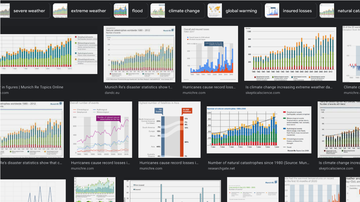
A screenshot of figures thematizing the upward trend of economic losses caused by natural catastrophes by the insurance company Munich Re.
FIG 1 / Screenshot by Isipedia
In my work as a scientist at Potsdam Institute for Climate Impact Research these questions concern me and my colleagues, as well. Although any recent climate impact observation probably contains signals of climate change, they are most often well hidden and we barely have studies that point out these signals and help to determine what proportion of changes in a system are due to climate change. The question that arises is how can we utilize climate impact models to show how much climate change contributes to the consequences of for example an extreme event? And in what way would model simulations differ if the climate of the world would have remained stable?
Looking for a method that carves out the observed signals of climate change
To deal with such questions my colleagues, other climate impact modelers and I worked together on a dataset for other scientists to use in their models. We wanted to strengthen the perspective that climate change has impacts in the present and that it is crucial to develop models capable of quantifying climate change as a driver in the systems that are somehow influenced by climate-related factors.
The basic idea behind our paper “ATTRICI 1.1 - counterfactual climate for impact attribution” is to figure out how much climate change influenced a certain observed phenomenon. We do this by seeking to answer the related question of what that phenomenon would have looked like if there had been no climate change. Comparing such modeled counterfactual to the modeled historical event can give us answers on the role of climate change. An important part of the exercise is that the modelled historical phenomenon compares well to the observed one. Putting this idea into practice comes along with some difficulties.
So for a quick dive into this: When someone uses a model that is able to simulate the climate impacts of a specific system (e.g. crop failure in the USA), they would first run a so-called “historical climate simulation”, which then can be checked against historical observations. It is important that the model reproduces the historical observations well and does it for the right reasons, because this makes us certain that the path from climate change to impact is well encoded in the model.
As a next step we look at the observational climate data, which we detrend to produce a version that mimics historical climate, but without trends related to climate change. We call this a counterfactual climate, which is what ATTRICI provides. In the mentioned case of the crop failure we would simulate how the system would look like if there had been no climate change. We also refer to this as the counterfactual impact baseline. If we now compare the counterfactual and the factual simulations, we can identify the influence of climate change on the modelled system.
This method described above is a practical way of determining the contribution of climate change on a particular trend or event, yet it is rarely used in models by climate impact researchers. One reason could be that the data of a counterfactual ‘no change’ climate world is missing. That is why we generate such data in our paper and make it freely available to all interested people in the climate impact modelling community. This is also a reason why my colleagues and I wrote our paper in our particular constellation, as we all work in the context of a project called ISIMIP. ISIMIP is a framework connecting climate impact models contributed by an international network of climate impact modelers. The project works really well in connection with our paper: It already has models that can incorporate climate change as a driver of changes in the modelled phenomenon, and there is a setup where we do historical runs in which we aim to reproduce the past as best as we can. What was missing was the comparison between these historical climate impact simulations (e.g. crop failures in the past) and the simulations of the counterfactual world, a simulation in which the climate forcing remains stable but all other drivers of changes in the system remain present.
Comparison to a world without climate change is needed to determine the contribution to its impacts (A quick overview of our approach)
However, we cannot observe a world without climate change, there is no “observed counterfactual”. Now technically we could compare the counterfactual simulation directly to the observed historical climate impacts. The only problem with this is that in this comparison we would not be sure if the differences between the worlds exist because the model does not represent the world well, or because climate change actually has an influence on the observed phenomenon. That’s why we also make simulate the factual historical impacts and then compare the two simulated worlds. In the end we validate the impact model to make sure that the simulated historical world fits well to the actual climate impacts that were observed and measured in the past.
Assigning the influence of climate change through comparison to a counterfactual
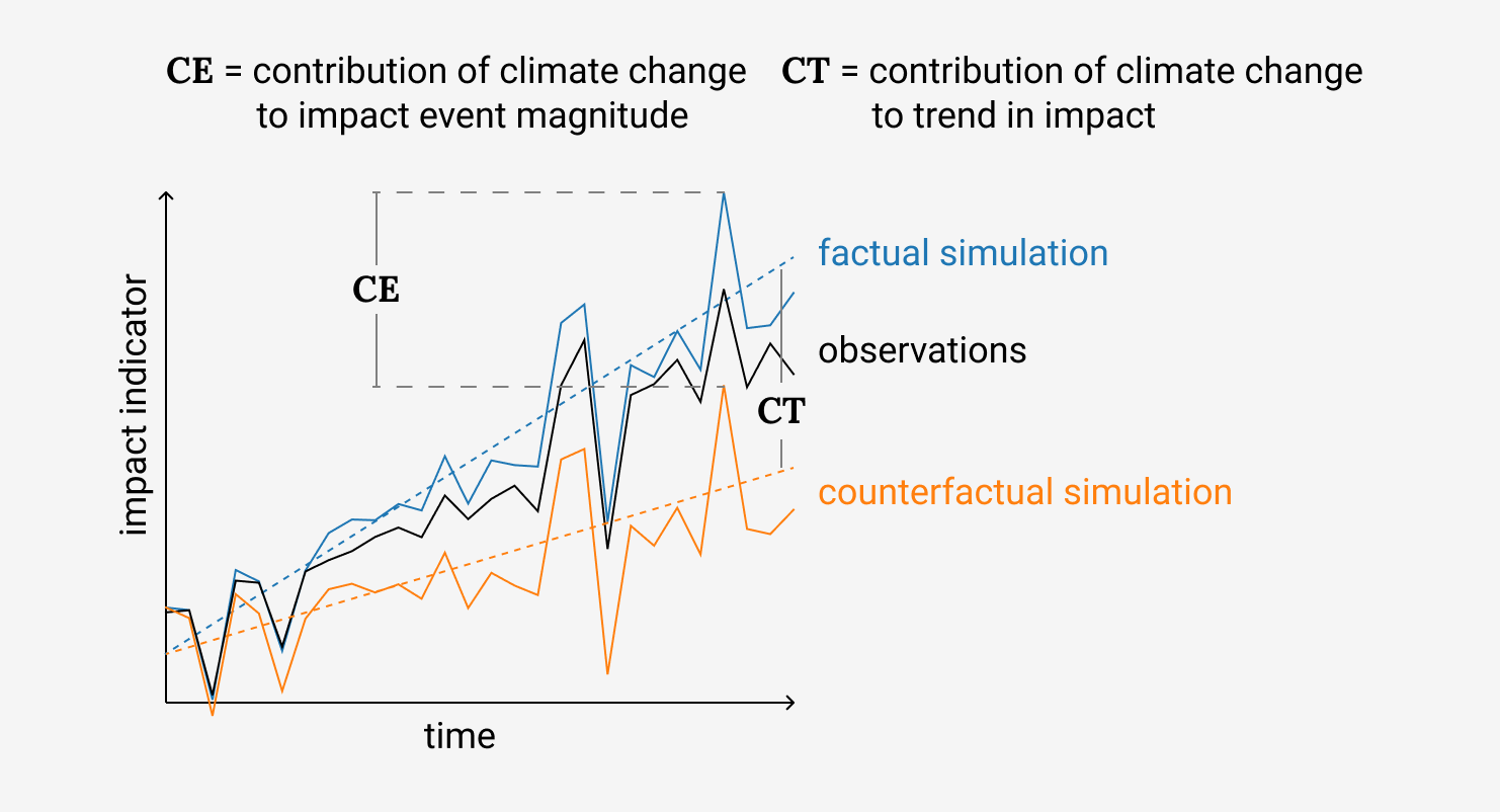
Illustration of the impact attribution: We compare factual (blue) to counterfactual (orange) simulations (attribution step) building on the agreement between simulated (blue) and observed (black) changes in human, natural or managed systems. Attribution can refer to trends (difference between blue and orange dashed lines, CT) and the effects induced by individual events (difference between blue and orange line at a specific time, CE).
FIG 2
This figure provides an overview of our approach, how observations of a climate impact, factual simulations, and counterfactual simulations of this impact come together as impact attribution. The significance of climate change in a climate impact is traced: CE and CT respectively show how we estimate the contribution of climate change to event magnitude and impact trend.
Recap of what we need for impact attribution:
We start with a factual simulation (blue line in figure 2 where our impact model (e.g. a crop model) is driven by the observed historical climate + everything we know about historical change of other disturbances and interventions (e.g in agricultural management or changes in cultivars).
We validate whether our simulation is able to represent the changes in the natural or human system we have observed (black line in figure 2). This could be the observed time series of maize yields. If our model is able to represent the observations, we can safely assume that our model can describe current climate impact observations as well.
We simulate the counterfactual world (orange line in figure 2) accounting for the same disturbances and interventions used in our previous simulations but with a stable climate.
The difference between our two runs of simulation is our approximation of ‘the impact of climate change’. This could either be a difference in trend (CT in figure 2) or a difference of the strength of an extreme event (CE in figure 2).
How do we propose to build a counterfactual world, with no climate change but based on observational data from its impacts?
Now we can go into the details of constructing this counterfactual climate forcing based on observational data of climate change such as daily temperature at a certain place.
As already mentioned, our method to create the counterfactual climate is to detrend this observational climate data. We estimate the long-term trend within the observational data and then remove that trend. The outcome is a quasi stationary climate with spikes, highs and lows at the same points in time as the observational data. In such an observation-based approach the extreme events are maintained in the counterfactual. They are stronger or weaker depending on how much climate change had an influence on them. You can see this whenever you look at the high and lows of the lines in figure 2.
You might ask what data is used in our counterfactual data sets and what method we used to describe the trend curve that we then remove to detrend these data sets.
In our paper we use datasets that provide daily measurements of temperature, precipitation, radiation, barometric pressure, wind, and humidity (see Table 1 in the paper for details), beginning with the year 1901. These are our climate variables, see dropdown in figure 5. This data is plotted on a 0.5° x 0.5° grid we typically use in ISIMIP.
In order to find the trend that we later remove for the counterfactual, it is good to have a variable that represents global climate change as a driver in the local data. For this we use the curve of global temperature increase.
When we then detrend this data we do not remove temporal (e.g. local change in daily temperatures per year), but only warming-related trends (e.g. local change in daily temperatures per °C of global warming) because climate data at each grid cell may actually rather change with global warming instead of time. To understand the basic idea you can imagine that you plot all 15th January temperatures at a certain location not against the year when they occurred but against the global warming reached in that year. Then you find the trend line describing the change in temperatures in this plot.
The way we detrend the data and include the annual variations are two key aspects of the method that we present in our paper and that distinguish our approach.
You can see this in figure 4. The blue line in the left panel shows yearly averages in the factual simulation, and the orange line shows the corresponding counterfactual data. You can see that they have similar spikes, ups and downs, but the orange line does not have a long-term trend, because we detrended it. In the right panel we show the change of the variable within a year, called annual cycle, for the early and the late period of the factual data and for the late period of the counterfactual data. The important thing to see is that the counterfactual simulation matches the yearly cycle of the early period well. We thus managed to undo the shifts in the annual cycle that happened over the years.
Factual and counterfactual time-series
Show time-series for .

Left panel: yearly average time series of factual and counterfactual simulations for various regions. Right panel: corresponding annual cycle (early and late 30-year periods).
FIG 4 / Adapted from Mengel et al. (2020).
We can’t handle every climate variable that constructs the counterfactual world the same way. In order to illustrate this difficulty I would like to share a brief insight into our work process to give you an impression of what working on the building of the counterfactual simulation can look like.
Let’s take the construction of the precipitation variable, because when you work with climate data, you nearly always learn that precipitation is one of the variables which is more difficult to handle. It is not as easy as describing temperature changes for example, which can be addressed with standard empirical models.
For example, if we want to describe how much and how often it rained in our models, the amount of precipitation on wet days can be described in a similar way as the fluctuations of temperature but you also have to describe changes in the amount of dry days. This is because not only the amount of rainfall changes, but also dry days may become more or less frequent. With dry days having increased over time there will also be additional wet days in our counterfactual climate forcing. And if the number of dry days decreased over time we have to define additional dry days to generate a counterfactual stationary historical climate. The other climate variables need approaches less complex than precipitation, but often still more complex than temperature. You can check for the success of our approach for each variable by checking whether we managed to remove the trend in the different variables, see figure 5 and figure 4.
Our counterfactual climate data and how to review its performance
After creating a counterfactual climate from observational data we have to somehow judge its performance. This section describes our way to do this in more detail. I will also present how our proposed data set of the counterfactual climate can be used to look at climate trends in the 20th century (figure 5).
We want to generate a counterfactual climate without major trends, but otherwise as similar as possible to the observed climate. To verify that this is accomplished, we run three types of control plots.
Three quality control plots to check our models:
We check for annual data on grid cell level: figure 5 shows the difference between the late 1990-2019 and early 1901-1930 average for both the observed data (factual) and for the counterfactual data. As our approach should have eliminated the long term trend in the observations, the differences in the counterfactual should be close to zero no matter how big the change in the observational data was.
We check for time series of regionally averaged annual data: figure 4, the left panel shows the temporal evolution of the observational annually and regionally averaged data compared to the temporal evolution in the counterfactual data which should not show a trend. In addition you can see that the annual fluctuation in the data is preserved by the detrending.
We check for seasonal trends on regionally averaged data: figure 4, the right panel compares the late 1990-2019 (blue line) to the early 1901-1930 average (blue dashed line) of regionally averaged observational data for each day of the year. In addition, the late 1990-2019 averages of the counterfactual data (orange line) are shown. Ideally these counterfactual data simulations should be close to the early 1901-1930 average of the observational data as there should be no trend in the counterfactual data.
20th century trends: factual and counterfactual
Maps of factual and counterfactual climate data. We show the difference between the late period (1990-2019) minus the early period (1901-1930).
FIG 5 / Adapted from Mengel et al. (2020).
Our approach performs differently depending on the geographical region and variable. In both figure 5 and figure 4 you can select the climate variable and the region. Here we use the Giorgi world regions (Giorgi and Francisco 2000) as an example. Temperature and precipitation in Northern Europe are cases where our proposed method works very well.
To conclude, a note of caution for using our data. There are limitations to our method and the produced data should be handled with much care. See for example the blue color over Tibet for precipitation and for wind speed over Greenland in figure 5. These cases are discussed in detail in the scientific paper. Those unremoved trends are largely due to data problems. For example, precipitation over the Tibetean Plateau (TIB) shows a strong drying trend over the first half of the 20th century in the GSWP3-W5E5 precipitation data that is assumed to be artificial, see section 2 in the original paper.
Since the trend is not related to global warming it is not well captured by our model. The detrending then leads to a positive trend over the second half of the century while the factual data, that is measured in this area, does not show such a trend. You can see this in figure 4, in the left panel. We have to live with these issues as we are limited by the data we work with.
So please always check carefully whether the counterfactual makes sense for your application. We also provide versions of figure 4 for different world regions and you can configure the free download of the data in the [ISIMIP data repository] (https://data.isimip.org/search/tree/ISIMIP3a/InputData/climate/simulation_round/ISIMIP3a/climate_scenario/counterclim/). You may use it for your own attribution project, using impact data and an impact model. When using the data make sure to follow the four main steps we described above. Perform historical impact simulations, critically evaluate them, run counterfactual impact simulations, and finally compare the historical impact simulations to the counterfactual ones. Especially critically evaluating them has to be done with care to ensure that the attribution effort is not only meaningful for simulated impacts in the model world, but also for real-world impacts. Don’t forget that you have to make sense of the counterfactual climate data you downloaded as explained in this section.
Affiliations
1 Potsdam Institute for Climate Impact Research (PIK), Member of the Leibniz Association, P.O. Box 60 12 03, D-14412 Potsdam, Germany